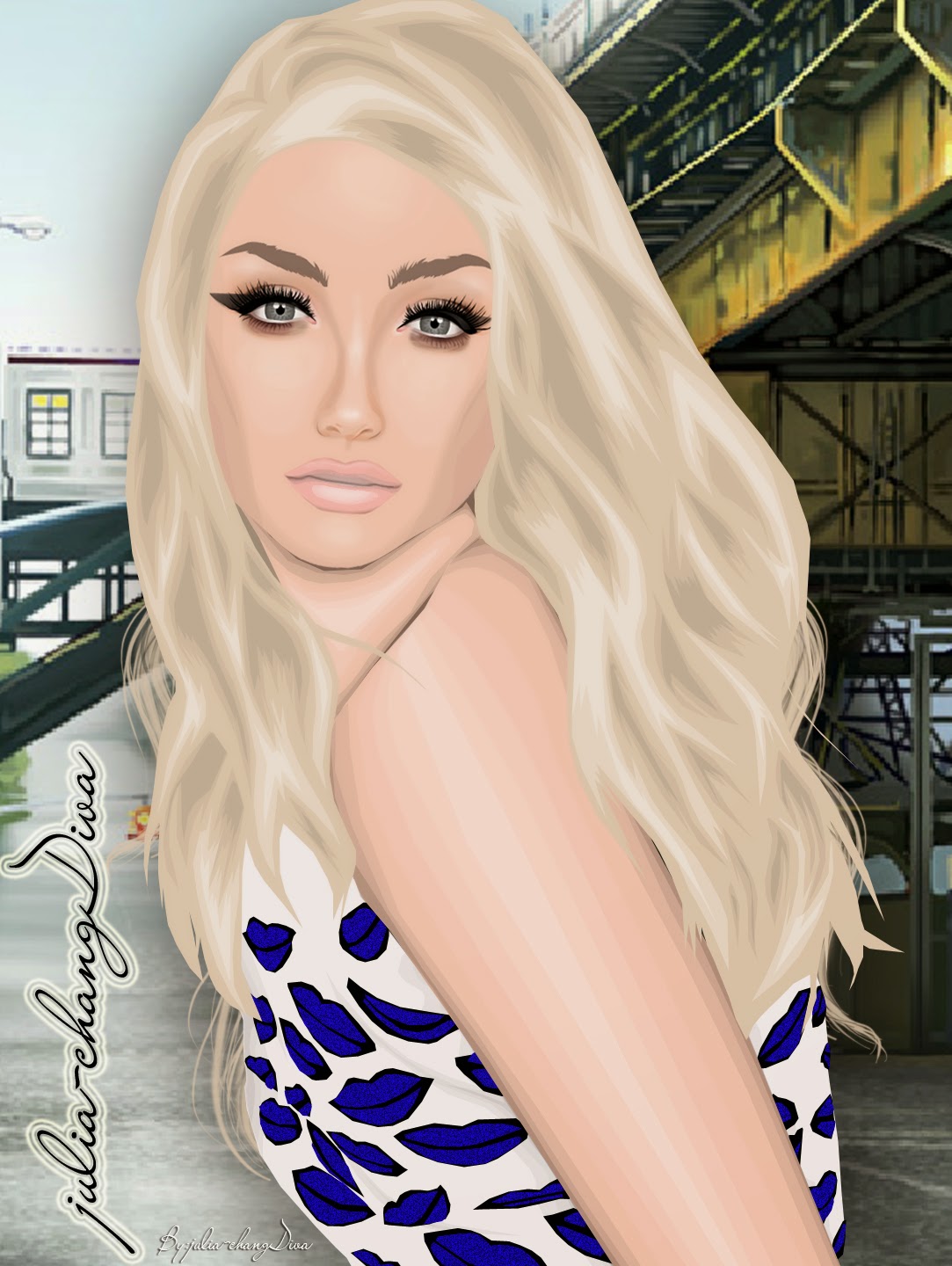
TOP PHOTO: Pablo

Kirsten: Very interesting concept and interpretation with the colour, you've definitely gone out to impress with this first task! It's a complicated pose, and although I see some anatomical issues, it's been executed pretty well. I quite like your shading technique on the clothing and look forward to seeing more, the skin technique isn't too bad, but I agree with Jack on working on the neck shading around collarbones. For me the hair is the only bit of a let down - it seems quite weakly worked on and, for me, plays with the proportions of the graphic in a way which doesn't really work out too well. But I have to say, great start!
RUNNER UP: Filip

Kirsten: Very interesting and modern concept you've gone for, the colour focus is great - however as a graphic for a graphics contest, I'm not sure it's that strong an entry. To me all you've had to do is work on the small portion of the neck - so if this is something you're going to do, it would need to be amazing and unfortunately it's not. The clothing really needs shading, even if it's just something quite minimal - otherwise, to me, it looks like it could have been done in under ten minutes with a photoshop filter, sorry! Good work though and I do look forward to seeing other concepts you use in your graphics.
3rd: Virginia

Kirsten: I think religion can be ... well it's difficult to put into words, for me, it's not something that should necessarily be put into graphics like this - I'm not a strictly religious person, however some people may be and could take offense from something like this ... just something to think about really. I agree with Jack that you've got the basics there, but impact is lacking - I'm assuming the purple is paint(?) but for me it's just kind of irrelevant in the message you're portraying with the concept you've gone for. The shading of the paint on at the hands looks fine, but it seems to have worn weak on the lower half areas. I would say you have potential in graphics though.
4th: Helen

Kirsten: This has such a striking impact when you first look at it, it's got a pretty strong overall look which comes from the pretty well made-up face along with the minimal facial shading. I like that you've tried to show different aspects to your graphic in including a large portion of skin, but also clothing - the jacket looks pretty good, but maybe some further definition of it could help it stand out that little more. I think the skin is alright overall, but be careful with the shading and highlighting like Jack said with the hand, but for me particularly around the rest of the chest because all I can see is the top of the sternum not matching with the bottom, it's anatomically impossible for it to look like that (apologies, you have a Human Biologist here!) But you definitely have potential with a little help in the right direction!
5th: Giselle

Kirsten: Compared to the other entries, this seems very basic and average - you haven't really stepped out of the boat in terms of creativity in picking a pose or something with a wow-factor. I agree with Jack that the hair and bustier are done quite well, but I almost miss those in the mix of (and I really hate to say this) kind of ugly shading and highlighting which looks almost randomly done. I think you really are just getting started in graphics and need a lot more experience in trying things out to get them right, but good effort.
6th: Rozalia

Kirsten: I won't comment on the cheekbones because I wholly agree with what's already been said - so my comment is now based on your graphic with a post-it stuck over the face on my screen! I really quite like it (apart from the hideously blurred face when the graphic is in full, please please fix this!), it's got quite a simple feel to it, but shows quite nice skill in clothing, hair and skin - it also really shows that you have a pretty decent ability in graphics already and with maybe just a little nudge in the right direction, you could use your potential to it's fullest.
BOTTOM THREE
Gabriel
Kirsten: For me this is quite a weak graphic - all I see is what looks like an armless hand wrapped around her neck - alike Jack, it's difficult to work out what exactly is happening there. I also don't see a great focus on the colour - that was the task so it should stand out and draw us in, but unfortunately it doesn't. If you're going to go for quite a close-up shot like this, hair needs to be stunning, and right now it's just basic and needs work - I think you could use a lot of time and effort put into practicing different aspects of graphics.
Beth

Kirsten: I'll firstly start with the fact that you've used my doll as the model - had I been asked and had said yes, this would be ok, but I wasn't asked and I'm afraid I would have said no - for me, permission is always a must with any model you use! The first thing I see is the RL background which I don't really like that much to begin with, but it doesn't seem to fit the more girly theme you seem to have chosen. It's all pretty basic if I'm honest and there's really no small details in any of the shading or highlighting, one thing which stands out is the upper hand. It's not particularly a stand-out graphic in terms of the concept or the skills used I'm afraid.
Natalie

Kirsten: There's a lot going on in this graphic, and I agree with Jack that the background completely distracts from the focus colour you should have stuck to - the yellow doesn't really fit in with the rest of the piece at all. Shading is very weak over all aspects of the piece - if you're going to veer away from using a Stardoll model, I think there needs to be something strong there to justify it, and it doesn't have that at all.
So, which one of you goes?...
Nobody does.
That's right. Unfortunately, due to several communication issues, Marycha was asked to resign her position, therefore taking the place of our first eliminated contestant.
For those of you who survived the first cut, take this as an opportunity to work hard and improve upon the faults we pointed out. I have hope for all of you and I want to see you all succeed!
Task 2 will be posted in the next few days.
woah, thanks so much! It's so flattering and i think everyone did a great job (:, i've always had issues making flyways i cant make them look smooth but i'll work on it for sure!
ReplyDeleteWoah! I think this is the best graphic I've seen Pablo make! It's truly exquisite. However I think that my favorite is Filip's as it's so edgy and artsy, a truly unique piece.
ReplyDeleteCan't wait for the second task!
Thanks soo much babe!! you excelled really
DeleteLovely entries! They make me want to do graphics again! Well done on the judging, too. As far as I can tell by now, this could be the successor of SNTGD.
ReplyDeletexoxo Cathy
Actually, it was many things in my life ,and when I realized it was July 27 ,of the same busy even reminded us that one could ask for a term ,but already organize me :)
ReplyDeleteExcited for next task!
ReplyDeleteThank you so much for the advices =)
ReplyDeleteAll the entries are fantastic!!
Xoxo
Rei
Wow, a big turn of events! I love love love these tasks!
ReplyDelete