*Prior to Task 3, Virginia (Rei1981) had to resign from the competition, but proceedings will go as normal
**Key parts of your feedback are in bold
TOP PHOTO: Filip

Kirsten: Personally I don't feel like this is the strongest graphic of the bunch this week, but it stands out in the crowd with its heavy feel. It is also a marked improvement on the entry sent last week. You have clearly spent time with the face, however there are some smaller details which could have been captured or worked on more carefully. Having said that, there are some aspects which do seem very much unfinished when I look at the graphic - for example the eyes seem especially flat and lifeless with almost no work on them when you look at the full sized image, and also the hair.
RUNNER UP: Pablo
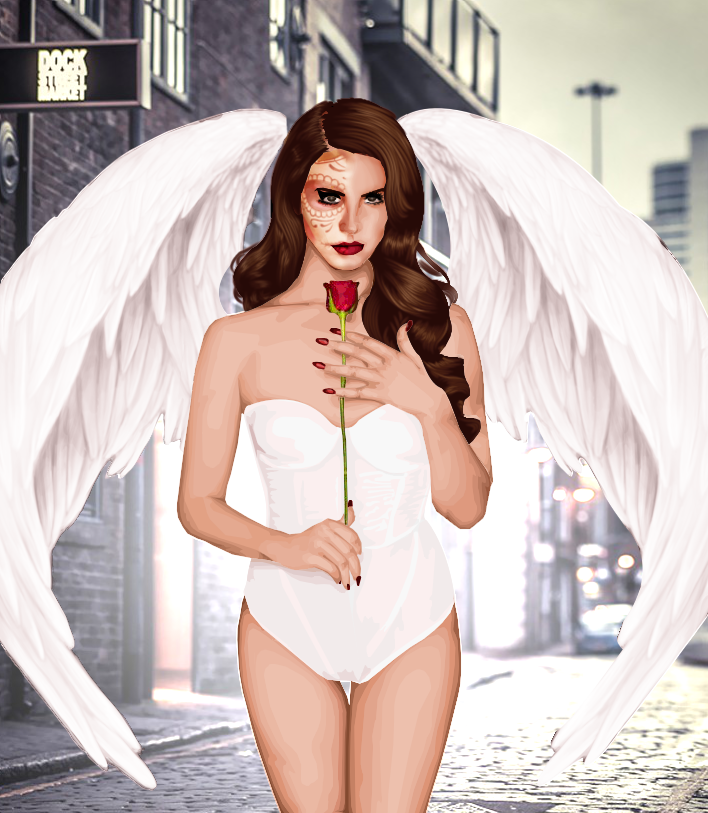
Kirsten: This image really stands out in the crowd from the warm light that the body gives off and it really draws the eye from a lot of the other entries this task. On close look though, you need to be a little more careful with your edges, at some places they're blurred and cut wrongly, and others they are more like corners and smooth lines. The skin has a pretty good technique, but maybe take some time with your clothing because I feel the item looks rather 2D in comparison to the densely shaded skin. Not very much a fan of the background - it doesn't seem to fit the theme of the actual graphic and adds a little detraction from the piece.
3rd: Rozalia

Kirsten: I really like this as a graphic, and I think it's because of your strength in skin shading over a lot of the other contestants - just be careful with a few of your edges though! The face is a little blurry though, particularly around the eyes, and I think the hair could use/take a stronger shade to make it really fit greatly with the rest of the graphic. With the clothing, I do think I have preferred the items you've shaded in the past, however white is one of the notoriously difficult colours to shade really well, so I commend you for doing a decent job. However without the 'Lana Del Rey' text, I would have no clue who was an inspiration for the piece, so just be careful of the brief - overall a great job though!
4th: Giselle

Kirsten: I'm a little confused on first look as to who your celebrity inspiration was because I don't really see either of the assigned stars in your entry, as Jack has said, I agree that this comes down to the model choice. The pose definitely has interesting aspects however I can't help but be drawn to the odd neck position - I think it would have been fine with the right shading, but in this instance it really wasn't there. You were definitely going in the right direction in attempting fur, however the texture or style used to work on it seems a little odd. Looking back over your previous entries, I can tell you are working on your basic skills, so just keep going with that and little by little it could all come together.
5th: Helen

Kirsten: I don't really see Lana in this at all, it honestly could be anyone. Your shading technique overall has been consistent throughout the tasks, however I think it gives them all a similarity and a familiarity and is starting to look quite easy and quick to do and not showing a progression in your graphic skills. I think this comes across in the face, as real faces take a lot of time to sculpt into looking real and to me it seems you've taken the quick route with this one. The hair's not bad though, I think it does add a little something to the graphic and pulls you just out of the bottom two.
BOTTOM TWO
Beth

Kirsten: There's a very odd feeling coming from this graphic, and I think it starts with the face - it seems a bit flat and not very appealing, sure it bares a Rihanna resemblance, but it doesn't make me want to spend time looking at the graphic. I do quite like the pose from the reference chosen and the clothing looks reasonable but not wow-impressive. I completely agree with Jack - if you're going to do a graphic where someone else has done a very similar one (e.g. same event) you need to make yours just as great (or better, if you can) as theirs, and when I look at this I just don't see the same wowing effect.
Gabriel

Kirsten: I'm very much not a fan of this graphic at all I'm afraid. The only positive I can really think of is that I can tell it's Rihanna, however it really ends there. It looks very quickly done, mainly due to the fact that you've chosen a close up and if you're going to do that, the areas it shows need to be amazing, and frankly, they're not. The layers of shading look rushed and done with little care and it really shows with the entry unfortunately, and at this point and having seen the competition, I don't think it's really good enough.
So who goes this week?
Gabriel.
Your entry this week was not up to the standards that are set for this competition. The collapse in your progress was snuffed out early. Sorry, but you have been eliminated.
Task 4 will be posted soon!
I am so happy to see my hard work as the Top photo! Mayn entries are very good and I mostly like Pablo's graphic and vision, also Giselle's vision of Rihanna is so well to me! Also, Rozalia's shading technique is so good, specially when you know how hard it is with white!
ReplyDeleteAwee bae i just realized you mentioned me here thanks!
DeleteThanks filip! Congratulations!! Thanks for the feedback It's sad to see Gabriel go, hopefully he'll keep practicing to reach new heights! I also fancied Giselle's work (personally) maybe not too rihanna but a gorgeous work overall
ReplyDeleteI'd also like to mention the reference of the background was in the song gods and monsters, that's why i went for a urban theme (:
DeleteThank you chico!! ♥
DeleteIt's not bad I'm the third :D And congratulates the other, but I do not know how to face does not have to be blurred it just comes out. :/
ReplyDeleteCongrats on topphoto, Filip! I'm really impressed by Pablo's work, especially by the wings, feathers are so hard to do right!
ReplyDeleteThanks babe
DeleteThank you Cathy! x
DeleteI liked Rozalia's but it read too much as a Jack knock off. The neck bones are very inspired by, that isn't a bad thing at all just a bit lacking. Coming into your own style is something i'd say is important for you. I don't know how the judges missed that in the critique.
ReplyDeleteMy favorites def were Filip Pablo, and Giselles
Thank you! (:
DeleteThank you! x
DeleteEach week Pablo and Rozalia never fail to impress me! I think rozalia is really improving! Pablo's graphics are just so awesome!
ReplyDeleteGreat entries!
ReplyDeleteIt was an honour being part of the competition.
Good luck in the next task!!
Xoxo
Rei